
A note before the work: published with the client's permission. All operational values visible in the screens are fabricated for demonstration.
The problem
A field operations product was already running in production for the company's own engineers, with a large backlog of requests behind it. Two things were missing. It sat inside the wider platform as an embedded frame rather than as part of it, looking like a separate product wearing a borrowed shell. And the customers paying for the work had no interface into it at all.
The redesign had two stated objectives: make the tool a native part of the platform rather than a window into another product, and build a customer-facing layer that did not previously exist.
The gap between those two sides of the transaction is the whole design problem. The operator is measured on execution efficiency, with continuous around-the-clock pumping as the internal target. The customer is not buying efficiency. They are buying consistency: the job they specified, executed as specified, with any deviation surfaced and explained. A job plan is written for a perfect world. In the field, temperatures spike, equipment behaves unpredictably, and an engineer deviates from the plan, correctly. The customer specified five steps and expects them completed. When they are not, they want to know why, because that deviation carries consequences into their own downstream processes. That information existed. It reached them late, through a phone call or an end-of-stage report, if at all.
What I was given, and what I wasn't
I was the first product designer on the work. There was no requirements document, no research to inherit, and no direct access to the customers the new layer was being built for. The stakeholders closest to those customers said directly, in the kickoff session, that they were assuming a great deal about what those customers would want.
I inherited an existing interface, a fixed technical footing (a web application running on a vendor industrial automation platform), and a production user base with a substantial backlog. The product controls hydraulic fracturing jobs, where high-pressure sand slurries (sand suspended in fluid, pumped at extreme pressure) are injected into wells to release trapped energy reserves. A "stage" is one phase in that multi-step operation. A "pad" is the well site itself. An operator at the pad controls execution in real-time. The customer who owns the well may be thousands of miles away.
I asked for the field feedback logs in my first session. I was still asking two meetings later. Naming those absences early mattered more than filling them quietly. If I could not validate with users, I had to make my inferences cheap to correct by the people who did know them.
Designing the system before the screens
Before moving pixels I mapped the information architecture around clear operational boundaries, because the right question was not what should be on this screen but who is looking at this screen and what are they trying to conclude from it.
| Persona | Primary responsibility | Design paradigm |
|---|---|---|
| Field Engineer | Pad, well, and stage setup; step control; side assignment; live pumping execution. | High-density control console with active overrides, stage advancement, and job stop controls. |
| Remote Operations Support | Equipment status, fleet health, alarm monitoring, and maintenance oversight. | Read-only telemetry matrix optimized for exception monitoring and early warnings. |
| Customer | Stage progress, deviation tracking, change requests, and post-job reporting. | Clean progress view providing visibility without access to execution controls. |
Access is role-based and no role gets everything. The model is multi-tenant, so the separation holds at the organizational level, not just the screen level. That analysis produced the approval-gated request flow rather than a direct control: the customer asks, the operator approves, the audit trail records both. The interface encodes the chain of authority because in a hazardous operation that chain is the safety mechanism.
Making the guesses visible
I did not have access to customers directly. They were field engineers at well sites in remote locations, their schedules were set weeks in advance, and the company's own liability team had opinions about direct contact. So I worked from recorded design reviews with the field team, a wishlist of features from the sales organization, and stakeholders who admitted they were assuming about customer needs. That constraint meant most of what I produced was interpretation, built on assumptions made by people one or two steps removed from the actual user.
The failure mode is that a plausible prototype gets nodded through and the interpretation underneath it goes unexamined until it is expensive. So I made a deliberate choice to surface those interpretations early and keep them visible to anyone who knew the customer better than I did.
So each significant build shipped with a companion document, written for the review itself: why this was built in one paragraph, the themes I heard in the source material named as themes rather than requirements, a traceability table mapping each signal to the specific way the build expressed it, numbered open questions each one a call I had made and wanted contradicted, what was deliberately absent and why, and what I needed from the review to move.
The opening line of the review section of every document was the same: the fastest way to make this prototype wrong is to nod politely. It was not a flourish. Agreement is the cheapest thing to get in a stakeholder meeting and the least useful.
The same instinct shaped how I ran the sessions. When a wireframe went out before a meeting and came back to silence, I did not open by asking whether anyone had looked at it. I walked them through it and asked what was wrong, what was missing, and what I had misread. Field engineers are not reviewers by training. They need to be shown something and given permission to react to it.
Nine iterations, and the one I took back
The version line is the argument.
I keep the reversal in here because it is the decision I would most want to be asked about. Simplification is the reflex move and it is usually right. Here it wasn't, and the thing that told me so was asking who is looking at this screen and what do they have to conclude from it.
Deliberate friction in safety-critical moments
In standard consumer software, friction is the enemy. In an industrial control system running at high treating pressures, frictionless design can be hazardous. An accidental tap during a high-sand slurry ramp can cause equipment damage that permanently closes the well. So we designed deliberate, contextual friction into the interaction model.
Customer-initiated change requests route through an operator approval step with a structured reason field, preventing unilateral interference with a live operation. Steps approaching critical thresholds require an explicit checklist confirmation before proceeding, not just a tap. Every approval, rejection, and deviation is logged with timestamp and role, creating an execution record the customer can review post-job. And color is reserved exclusively for operational state: green for nominal, amber for warnings approaching threshold, red for active safety-critical conditions only.
The confirmation checklist also marks one of the two real decision forks in the version history. It appears in some builds and not others because the risk model that would define when to require it had not been agreed. I would rather show that oscillation than hide it. The unresolved item was not the checklist design. It was that a safety-critical interface decision was waiting on a conversation nobody had scheduled.
Outcome and what I would validate next
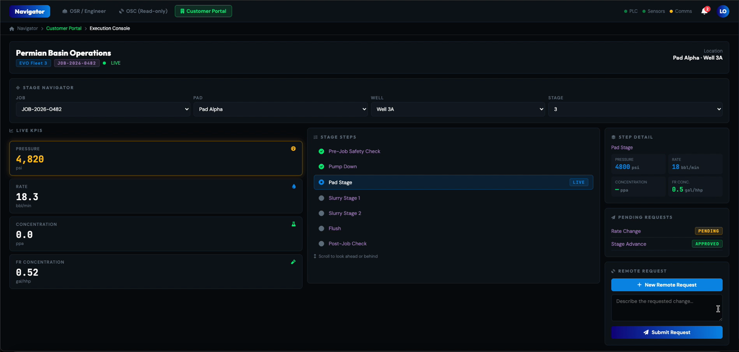
Success criteria were defined in the first session, before any design existed. Customers should see the jobs they requested, progress at a summary level rather than step-by-step, any deviation from what was requested, and a complete execution record. The console had to feel native inside the platform, and it had to absorb new operation types as they were added without a redesign each time.
Two months in, the client returned a document with eight specific modifications: surface the customer context, add the monitored operating values, show location, allow looking ahead and behind in the sequence, expose step detail on demand, and add the remote request actions. Refinements to an accepted structure, not a change of direction.
The work has not shipped, so there are no measured outcomes, and I would rather say that than dress a prototype in numbers it has not earned. What I would instrument: time from deviation to customer awareness, volume of status calls into the operations center, share of change requests submitted through the console rather than by phone, and time from submission to operator approval.
Open at the time of writing: the safety-critical confirmation session that would settle the risk model, which alarm data the business decides to expose to customers at all, and the access model gating entry to the console.
What I would do differently
I asked for the field feedback logs in my first session and accepted "we can get you access" as an answer. I was still asking two meetings later, and I designed the entire customer tier without ever reading the recorded complaints of the people already using the product. Everything downstream had to be inferred from stakeholders who told me plainly they were assuming.
I would now treat that artifact as a blocker rather than a nice-to-have: name it as a dependency in writing, put a date on it, and say what I will have to guess at instead if it does not arrive. The framing documents were my compensation for not having it. They were a good response to the problem. They were not as good as having the logs.