
A note on what this is. FinanceFlow is a concept I invented for myself, not client work and not a shipped product. I built it to add finance, dashboards, and data visualization to my range, and to pressure-test my own design judgment on a genuinely hard problem. The reasoning below is real. The constraints are ones I set. I'm labeling it plainly because a concept honestly presented is worth more than a concept dressed up as something it isn't.
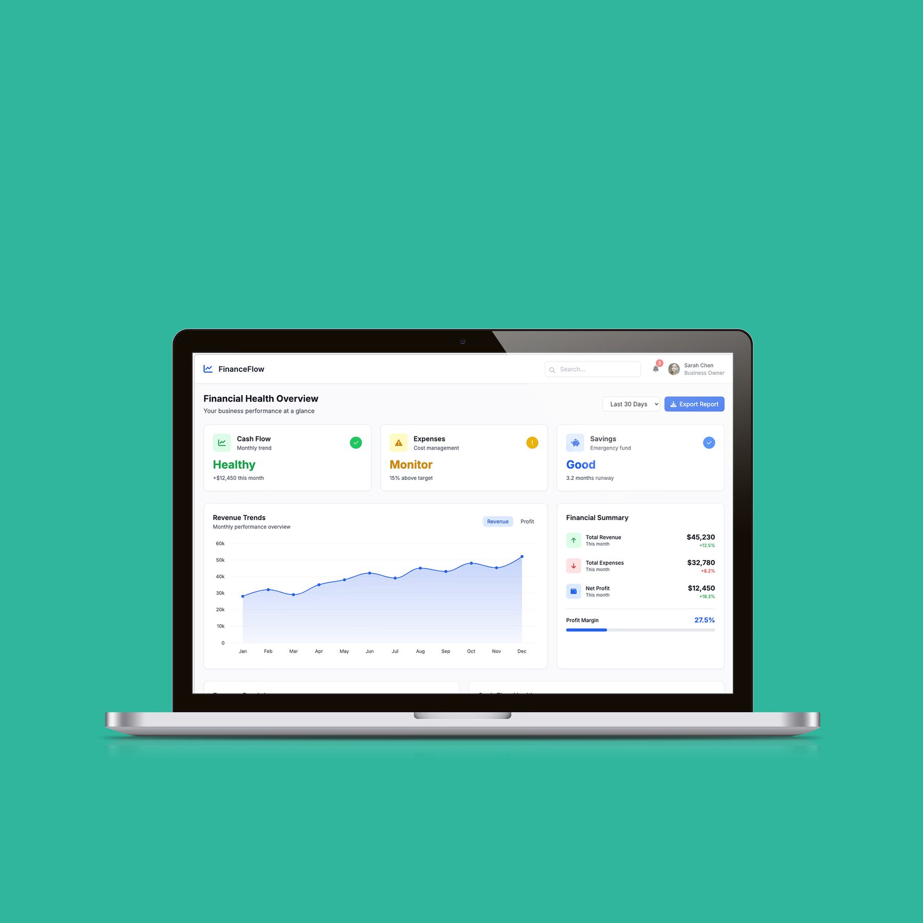
Why I made it
Two reasons, both honest. I wanted finance, data density, and dashboard design in my portfolio, areas my shipped work didn't cover. And I wanted to hand myself a hard design problem with no client to hide behind, to see how I'd reason through it alone.
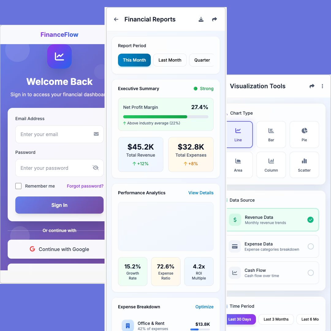
The problem I set
Financial dashboards fail in two opposite directions. Show too little and the user doesn't trust it: where's the detail, what's underneath this number? Show too much and you get a wall of figures nobody can act on. The design question I gave myself: how do you let someone move fluidly between the big picture and the fine detail, on their own terms, without ever feeling lost or overwhelmed?
How I reasoned through it
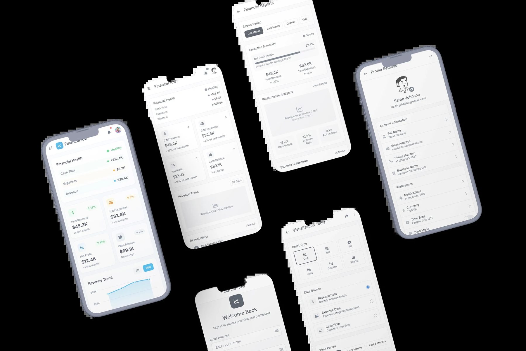
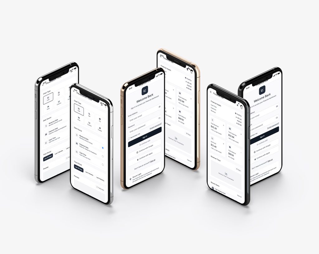
Progressive disclosure, in deliberate levels. Rather than one dense screen, I designed the information to reveal itself in tiers: a top-level state that answers "how am I doing?" at a glance, with the ability to descend into "why?" and then "show me everything" only when the user asks for it. The person controls the depth.
A useful thought experiment. To keep myself honest, I designed against an imagined stakeholder who treats no data point as expendable, someone who'd fight to keep every number on the screen. It's a device, not a real person, but it did real work: it forced me to justify every hide-and-reveal decision rather than defaulting to "just show less." If I couldn't defend tucking a figure into a deeper tier, it stayed.
Charts chosen for the question, not the aesthetic. Line charts where the story is a trend over time; bars where it's discrete comparison. The point wasn't variety. It was matching each visualization to the specific question that view was meant to answer, and refusing decorative charts that looked rich but said little.
Semantic color. Color earns its place only when it carries meaning (state, direction, threshold), never as decoration on a screen where every hue could be mistaken for a signal.
What exists, honestly
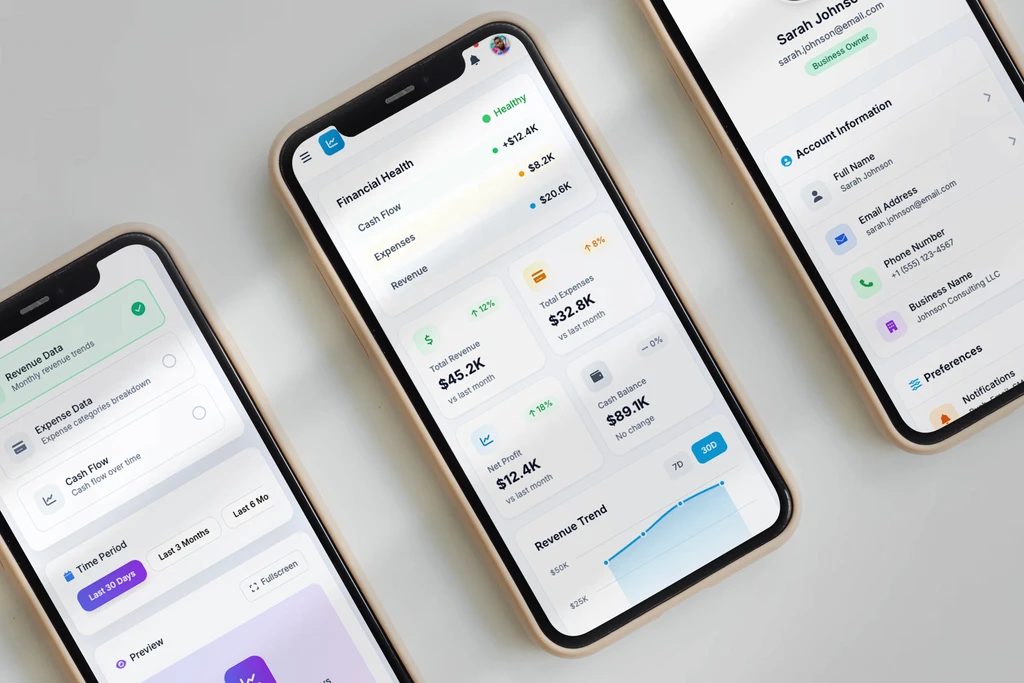
The concept and the reasoning are the deliverable here. This lives as a design concept and an argument, not a clickable prototype or built UI, and the research behind it was light, mostly my own analysis and assumptions rather than user studies. I'm stating that directly because the value of this piece is the thinking, and overselling the rest would undercut it.
What I'd do to take it further
Put it in front of real people. Every decision above is a hypothesis I reasoned my way to, not one I've validated. The honest next step for FinanceFlow is the same lesson EatNeat taught me: reasoning on my own screen only gets you so far: the test is real users, real data, real feedback.