
What I was hired to do
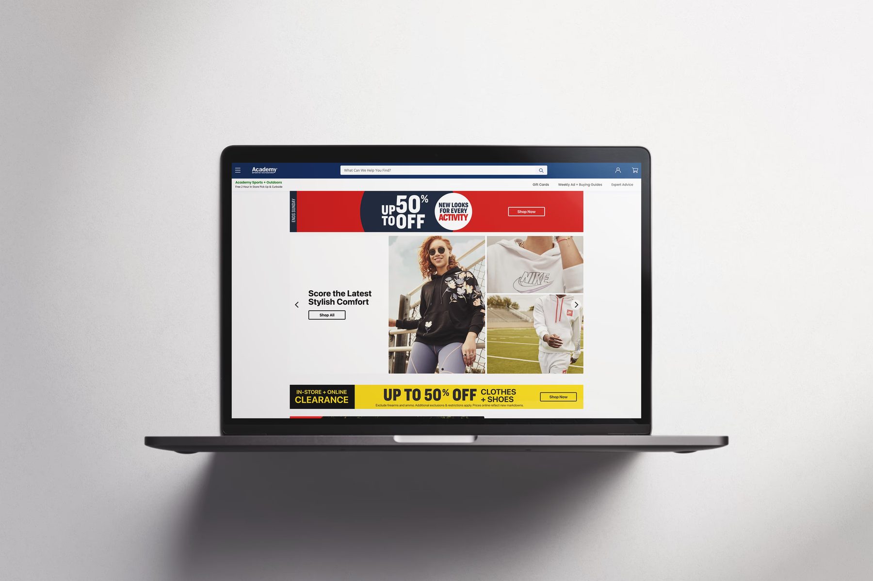
Academy Sports + Outdoors brought me on as a visual designer on a 90-day trial. The job was narrow: design the homepage of the e-commerce site for one calendar week, then hand off to the next designer in the rotation. There were two of us when I started, later four, each owning a week, each working off the same source of truth: the printed sales circular that landed in customers' mailboxes.
They kept me after the trial. What follows is not what I was hired to do. It's what I talked my way into doing over the next few years.
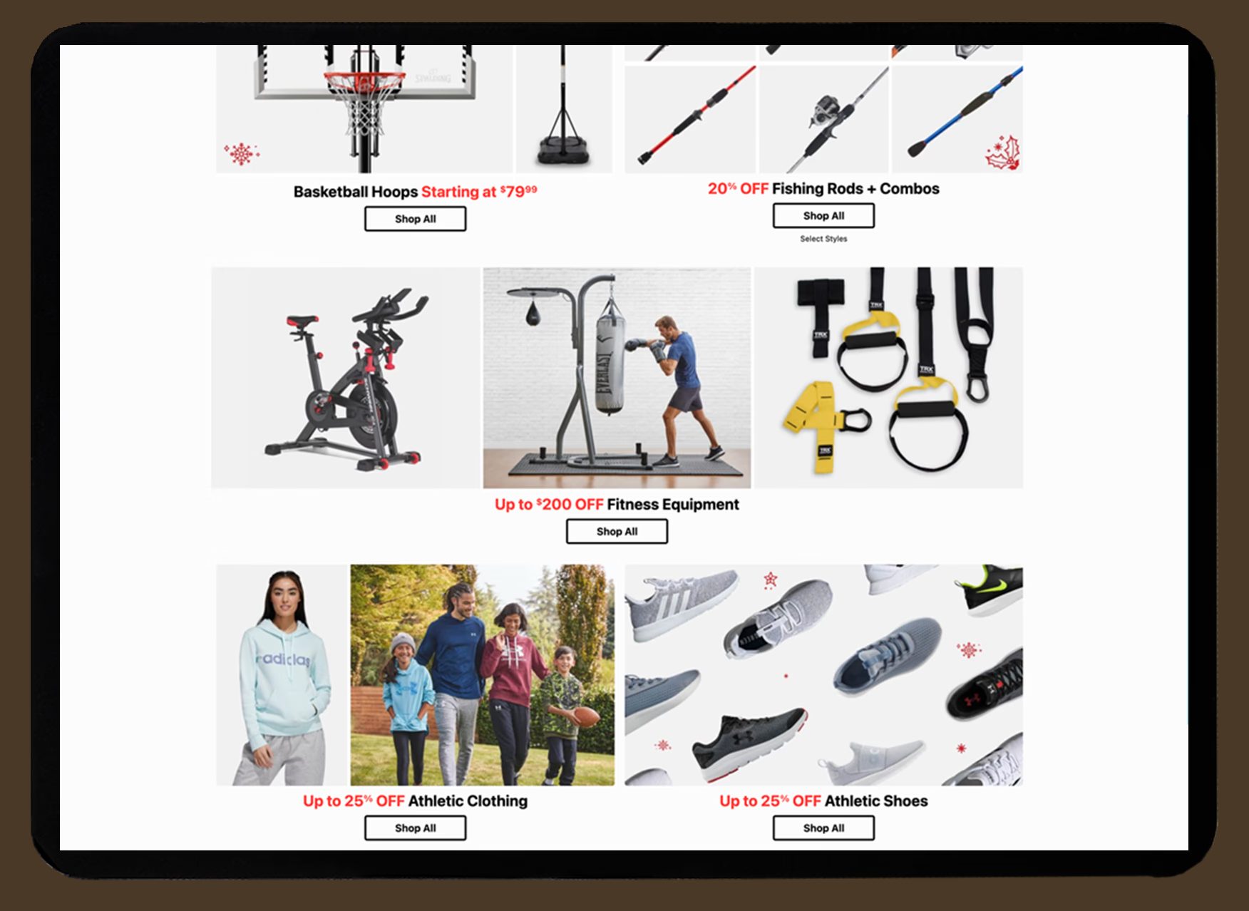
Stage one: there was no system
Every week was a fresh free-fall. No design system, no shared components, no information architecture from a design standpoint: just the print piece, reinterpreted weekly by whoever had the week. Too many voices, no continuity, and a homepage that looked like a different company depending on the calendar.
About a year and a half in, I stopped waiting for someone to fix it. I researched and built a system of tiles and templates, a repeatable structure the whole rotation could design against. It wasn't assigned. I built it because the chaos was untenable, and then I did the harder part: I got the team to adopt it. Once they did, we moved faster and, for the first time, spoke in one visual voice.
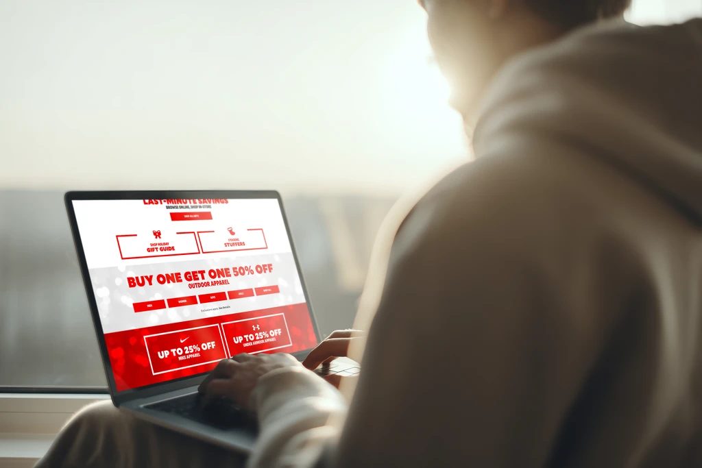
Stage two: we didn't actually know our customer
The system fixed how we worked. It didn't answer a question that started bothering me: did we understand who we were designing for? I didn't think we did.
I spent serious time on competitors' sites to see how they handled the same catalog. Then I did the thing nobody asked for. I went to ten brick-and-mortar Academy locations and talked to actual customers about the website.
The pattern was consistent and damning. Customers tried to search. They couldn't find what they came for. So they gave up, and drove to the store.
The hardest call: admitting the site was broken
Here's what made this genuinely hard, and it's the crux of the whole project.
The failure was invisible by design. A customer who couldn't find a product online didn't rage-quit in a way analytics would flag. They calmly got in the car and came to a store. And Academy (a company whose entire identity was in-store, in-person, foot-traffic-first) read that store visit as success.
So the call I had to make wasn't just "the site has usability problems." It was arguing, to a company religiously devoted to physical retail, that some of the in-store traffic it celebrated was actually a symptom of digital failure. That the North Star everyone trusted (the print circular, the store visit) was partly masking a broken online experience.
Two paths sat in front of us: keep doing what had always worked, or believe what the customers were telling me. I took the research to my supervisors and then to the executive team and made the case for the second.
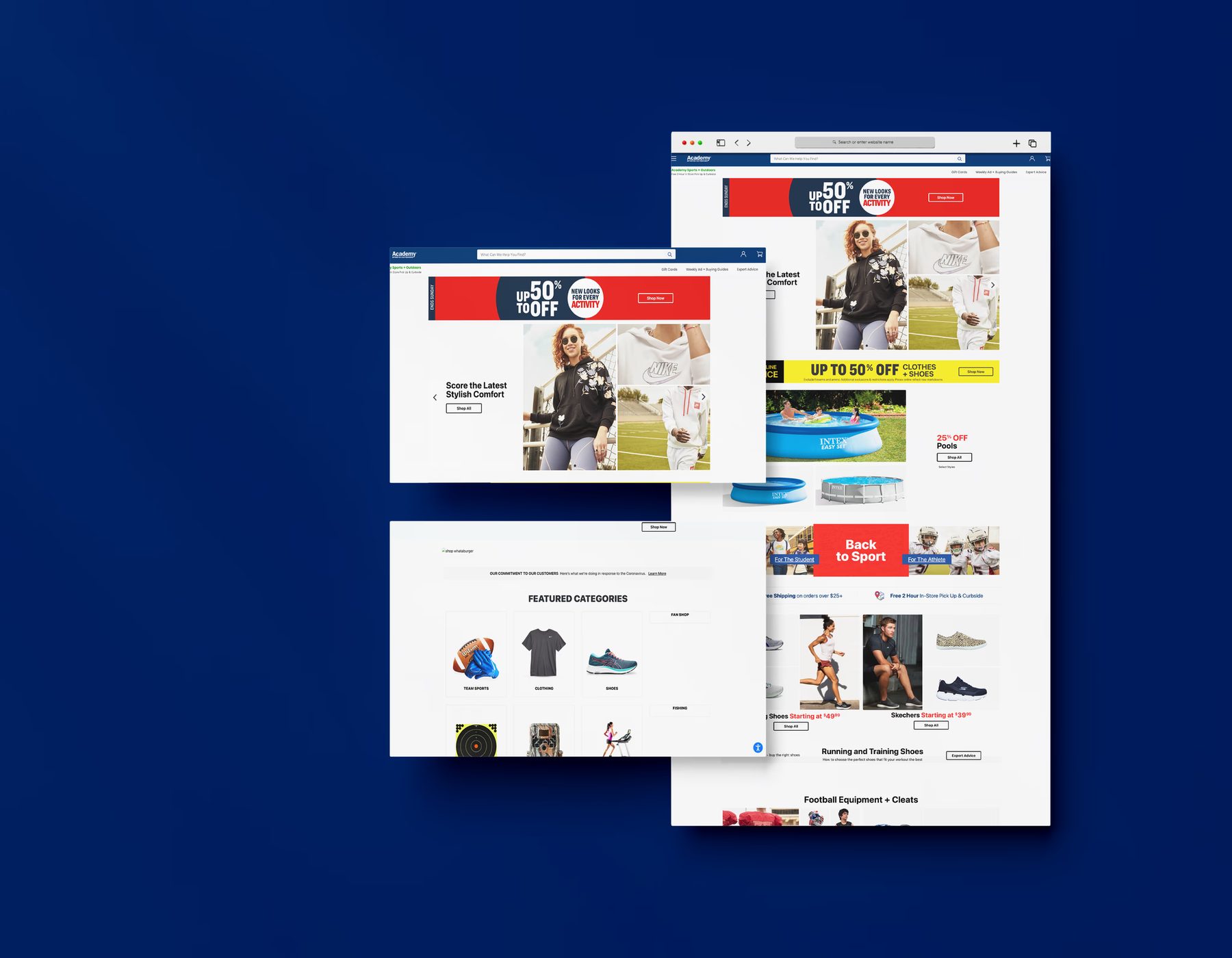
What shipped
The proposal I drove led to an upheaval of the site's search and taxonomy, restructuring the catalog around how customers actually shopped rather than how the print circular was organized. I want to be precise about my role here: I drove the research and the proposal that made the overhaul happen. The IA redesign itself was a team effort. My contribution was the system before it and the argument that started it.
Pushback
The resistance wasn't loud, but it was structural. People had grown reliant on the system in place and on the printed sales pieces as the North Star. And a faction still saw e-commerce as a nice-to-have bolted onto the real business: the stores. Digital wasn't the focus; in-store traffic was the end-all.
The way through wasn't a better argument in a meeting. It was the customers' own words from ten stores, and eventually, the results.
Outcome
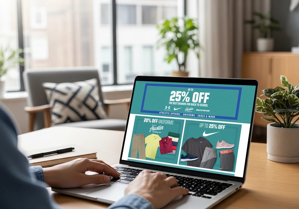
The restructured experience shipped ahead of the holiday season, and that season went on to post record performance for the site.
As I recall it, conversions rose around 35%.
I'll be honest about causation: I can't separate my contribution from every other factor that season, and the redesign itself was a team build. What I can tell you is what I saw and what changed. Site usage increased. People spent more successful time on the site, sessions that ended in actual sales rather than a trip to the parking lot. And the record holiday numbers got the attention of exactly the people who'd doubted the site mattered. That shift in belief is arguably the realest outcome: it helped drive the company's push to develop the Academy app.
What I'd do differently
Nothing about the direction, but I'd fight for buy-in earlier. I spent too long letting the evidence accumulate before making the executive case. The customers were telling us the same thing the whole time. I could have started listening out loud sooner.